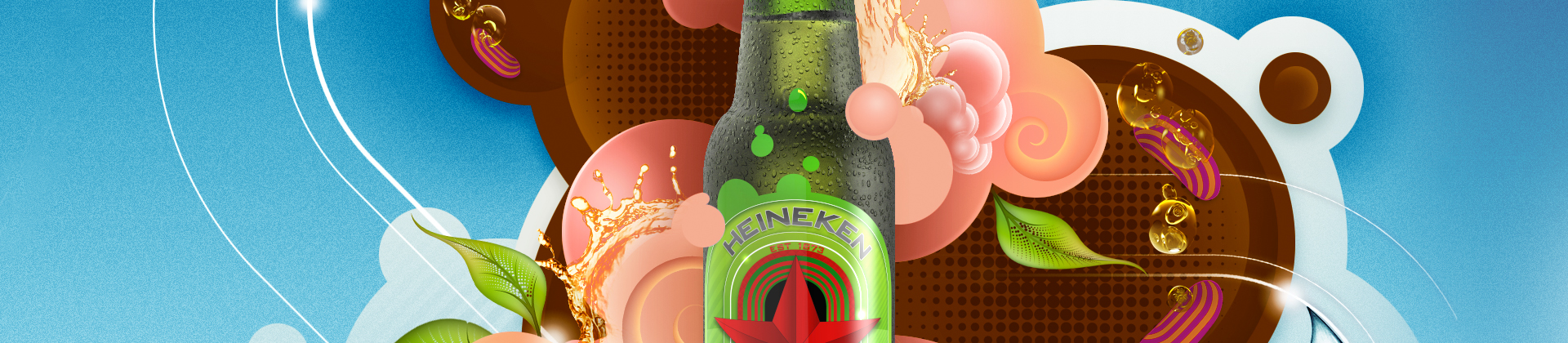
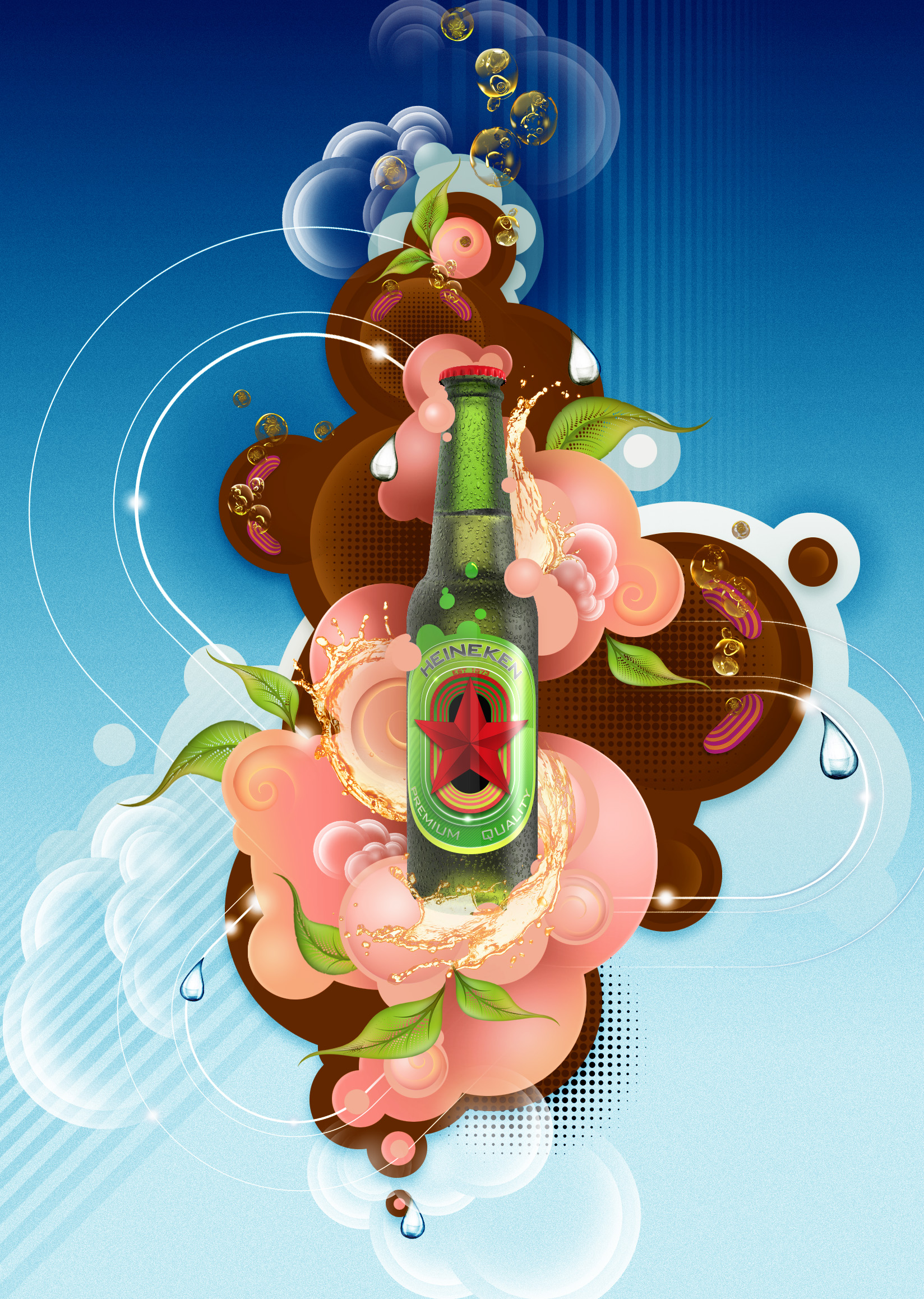
My role in this project was primarily to explore a newer, younger feel to the brand. I was tasked with giving it a fresher feel and one that was quite a large departure from the product’s older, more established identity. Initially I looked closely at the established colours and sought to enliven our palette a little more. It was not possible to stray too far from the original ident though as it has a pedigree of over 100 years.
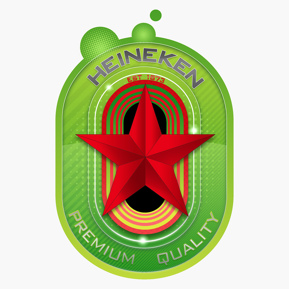
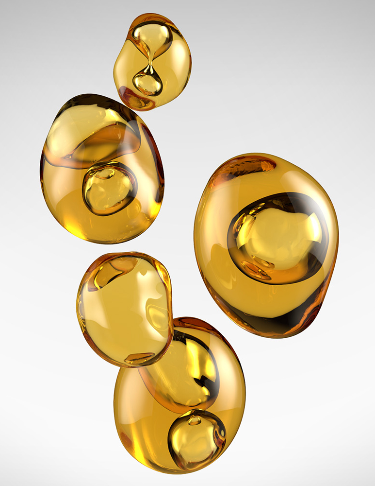
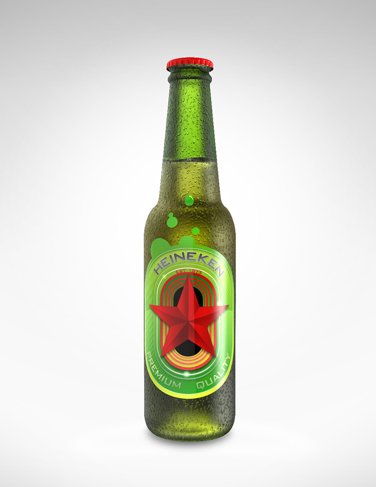
There were key aspects that had to be incorporated into the brand, its established date, naturally, it's name and the star. Texture was another aspect I felt keen to explore given that the product itself has such a rich texture. This was an aspect we felt was somewhat missing from its traditional origin. I was also fortunate enough to create an illustration to contextualise and compliment the product but needed to make sure that the artwork didn’t overshadow or knock back the brand in any way whilst, at the same time retain its demographic.
Below is my re-imagined star, quite literally, of the brand. At this stage I just wanted to see how far I could push the concept and ended up with some very interesting results. Here’s one of them. A few elements from our artwork which include our CG bottle, groovy CG bubbles and the limited edition branding that I also created. I also made a short animation showing our Heineken star appearing out of a branded tunnel. Needless to say I had a lot of fun making this.


Agency promo
Social promo piece
Mercedes Benz Magazine
Editorial artwork
Vector and type fun
One of a series of vector pieces
Various Publications
Editorial artwork
Symmetry In Nature
Limited edition prints and NFT's
Packaging Art
Limited edition Fanta artwork
Australia Post
Business prospectus
Typography art
Feature for EYE magazine
Rock St Journal
1980's audio comparison
BMA Magazine
Halloween history illustration
Babyliss
Limited edition packaging
Mercedes
Life In The Fun Lane artwork
Walls
Internal marketing for Unilever
Beauty Styling
Limited edition product packaging
Five Mile Press
Book jacket for novel set in London
Butter Artwork
Launch product artwork
Nestlé
Yummy milkshake flavours
Experian
Brand development
Future PLC
Urban music scene
Licensing series
Limited edition collages
Immediate Media
Isometric gourmet cooking
Condé Nast
101 Great Gadgets
Dennis
Love of tech
Patrón
Limited edition packaging design
Crest
Launch campaign
Official Windows 8
Isometric gaming factory
Nike
Dynamic sneaker artwork
Number 1
Tech compnay rospectus
PC Format
The future of digital interaction
Cycling
Abstract print
Hearst
Women's Health Magazine
ALM Media
Consultant Magazine
•Net
Responsvie web design
Prog Rock Awards
Trophy and promo art
Heineken
Branding and advert
Total Film Magazine
Blockbuster heritage illustration
Smirnoff
Asian promo campaign
Future
Legends of gaming
Future
Isometric cloud computing
Decal Girl
Licensed animal artworks
Dennis
Style icons / Anglepoise
Microsoft
Isometric computer upgrades
Flying Colours
Promo artwork for debut album
©2026 AkA illustration - All rights reserved


