Feature for EYE magazine
I love working on interesting and unusual projects and this one came in the form of a commission for the peeps at EYE magazine. This magazine is all about the creative industry featuring stuff about typography, and graphic design mostly. The article my artwork was to accompany was about typography and the ‘theme’ for this was based around different type weights and the effects they can have in visual communications.
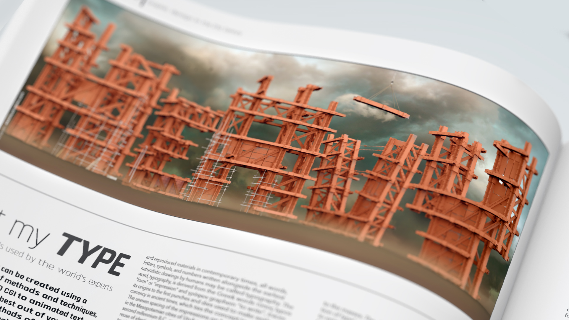
I thought it would be nice to show the typography being constructed using heavy metals and girders to convey the weight aspect. I also got to create some great texture maps for my 3D structures with some fun rust details and heavy scratches (on the hi-res piece). To add a little more gravity to the ‘weighty’ subject I also created a grim looking sky with lots of broody and heavy clouds. My final piece of the artwork was to add some low level mist near the base of the structure and from start to finish the project took me just under four days to complete.
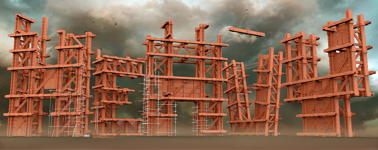
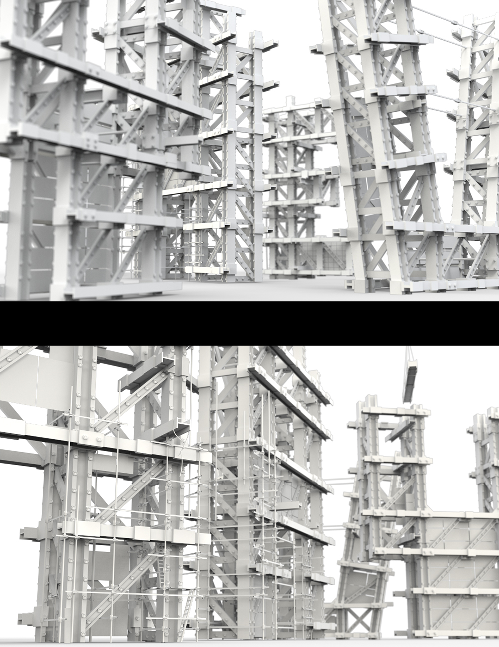
The structureIn order for my model to have the 'gravity' and sense of scale it was crucially important that the render angle was as low as possible to try to ensure that the viewer got the impression that the structure was towering above them. This meant placing the render camera really low to the ground to give this effect. To add enhancement to the sense of scale I also added some small birds flying from the top of the structure. Additionally the ladders and scaffolding add to the sense of scale and add to the impression of weight.
©2026 AkA illustration - All rights reserved