Branding work
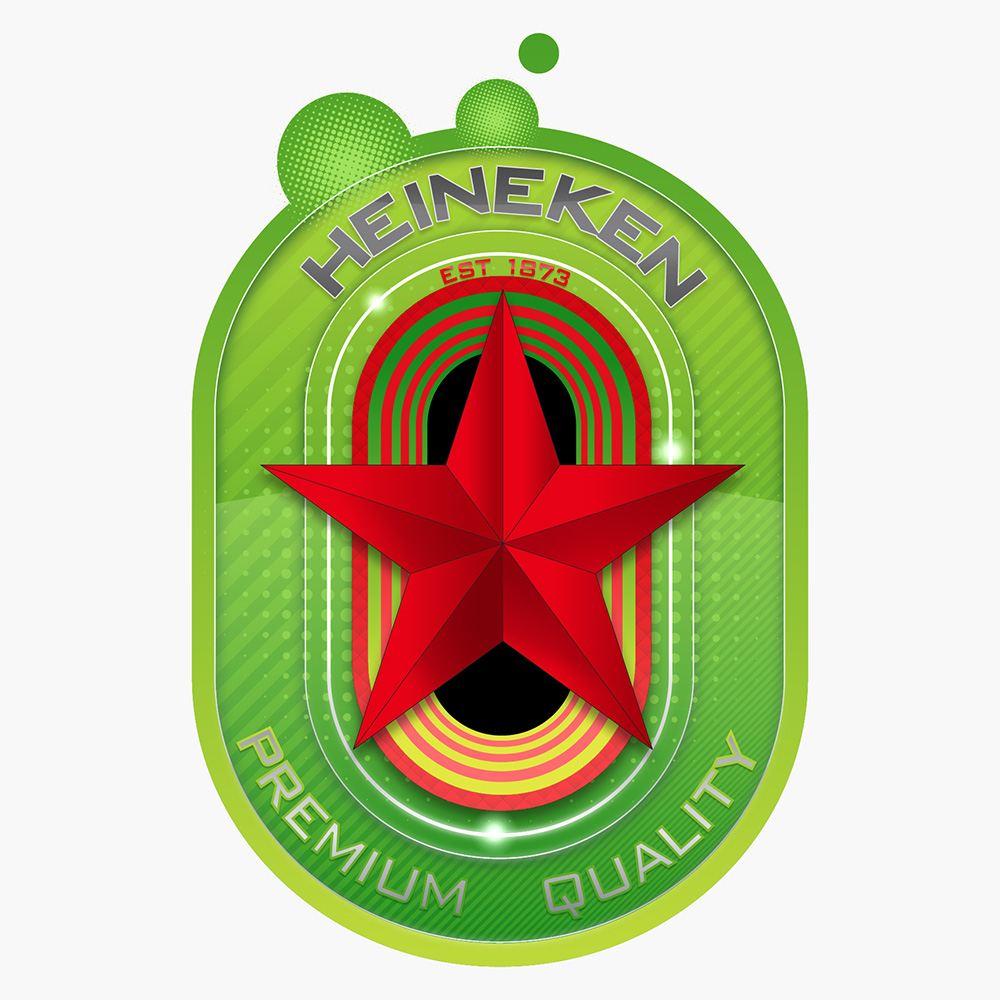
My role in this project was primarily to explore a newer, younger feel to the brand. I was tasked with giving it a fresher feel and one that was quite a large departure from the product’s older, more established identity. Initially I looked closely at the established colours and sought to enliven our palette a little more. It was not possible to stray too far from the original ident though as it has a pedigree of over 100 years.
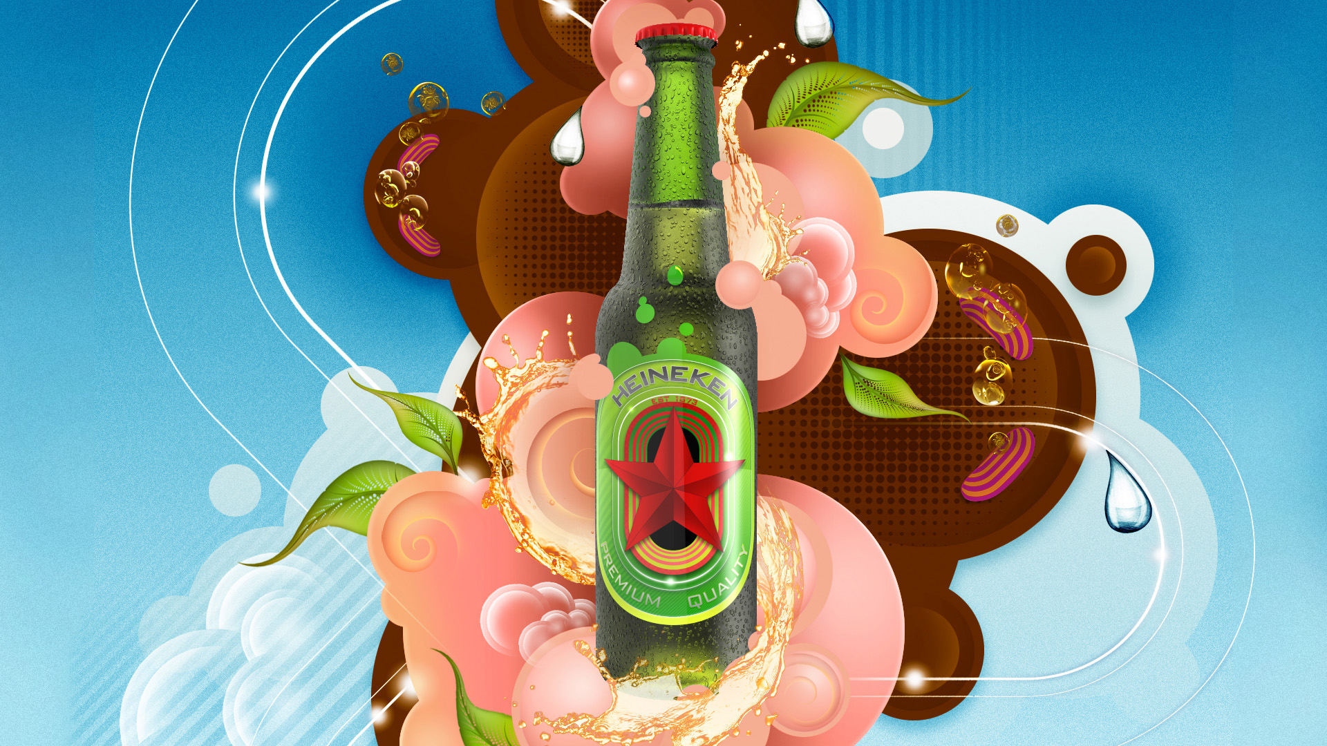
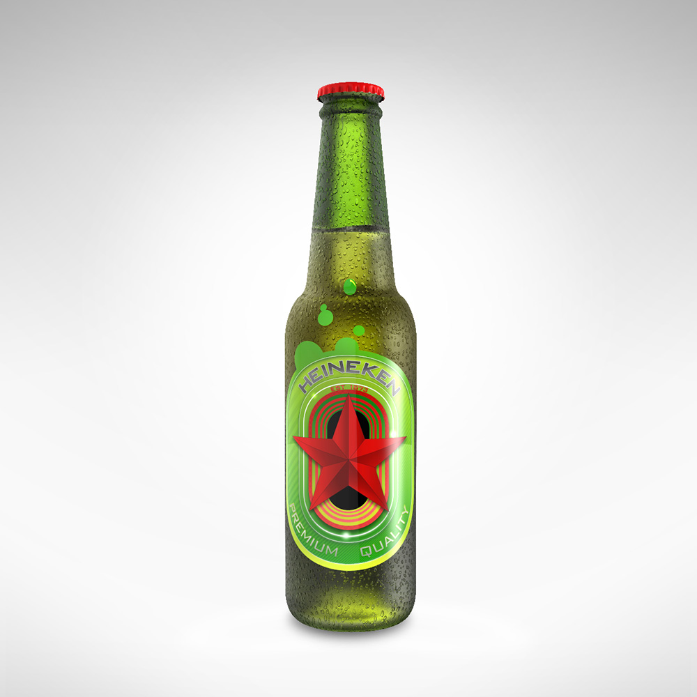
There were key aspects that had to be incorporated into the brand, its established date, naturally, it's name and the star. Texture was another aspect I felt keen to explore given that the product itself has such a rich texture. This was an aspect we felt was somewhat missing from its traditional origin. I was also fortunate enough to create an illustration to contextualise and compliment the product but needed to make sure that the artwork didn’t overshadow or knock back the brand in any way whilst, at the same time retain its demographic.
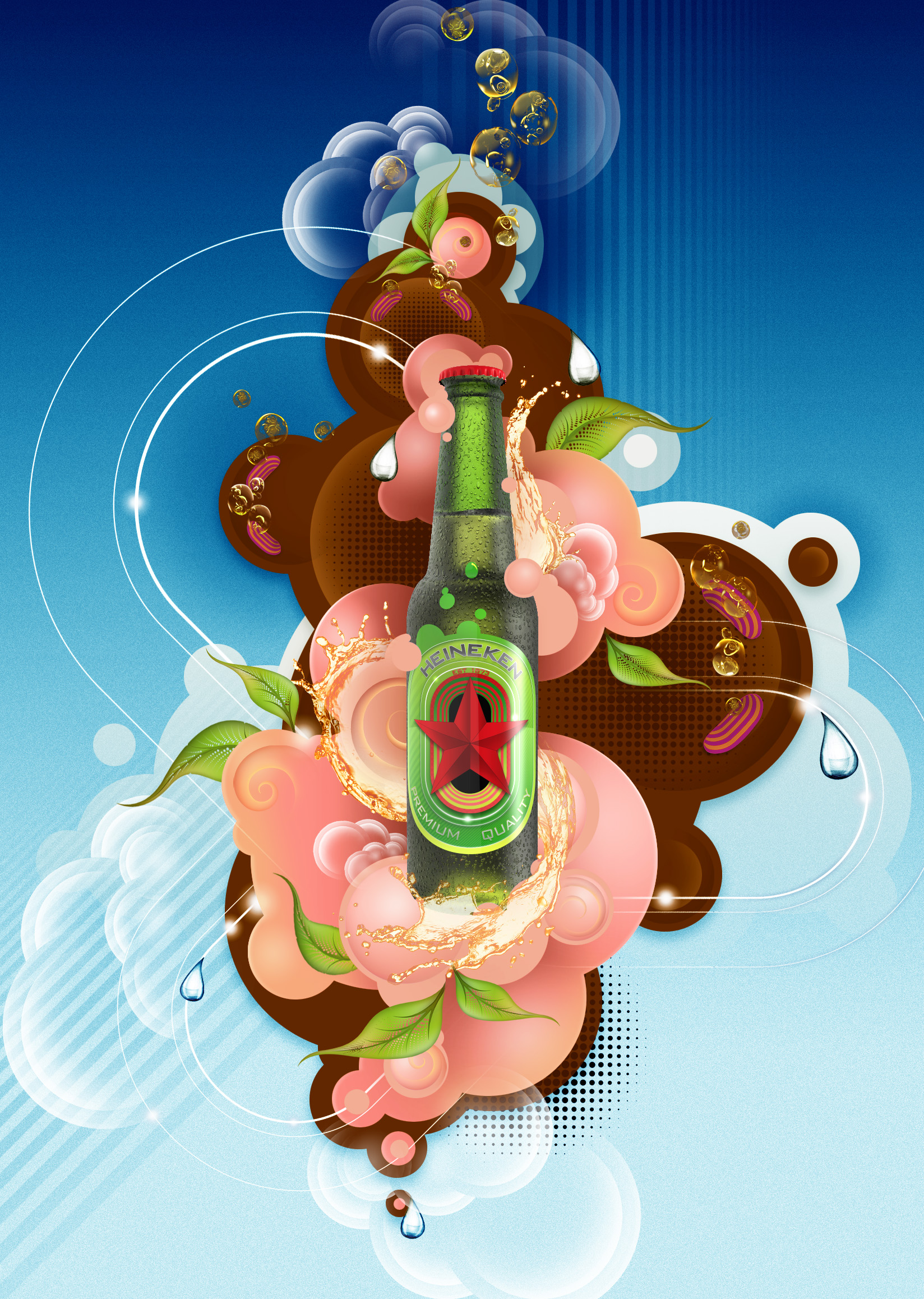
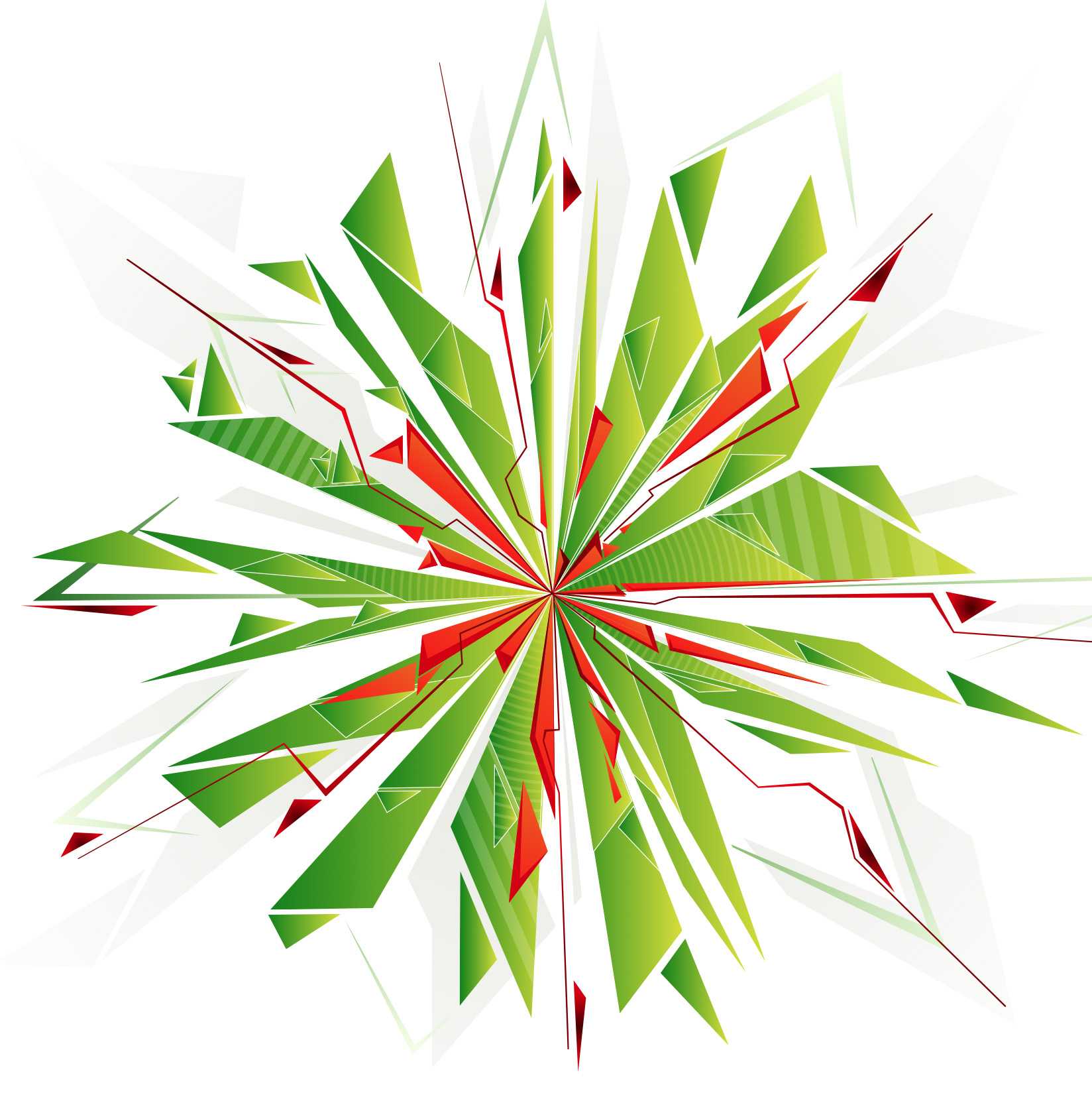
Above is my re-imagined star, quite literally, of the brand. At this stage I just wanted to see how far I could push the concept and ended up with some very interesting results. Here’s one of them. A few elements from our artwork which include our CG bottle, groovy CG bubbles and the limited edition branding that I also created. I also made a short animation showing our Heineken star appearing out of a branded tunnel. Needless to say I had a lot of fun making this.

©2026 AkA illustration - All rights reserved